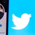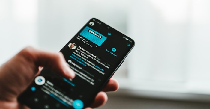
Ditching the company’s well-known logo and changing its name to a letter often associated with danger, death and the unknown is only the latest user-aggravating step CEO Elon Musk has taken since he bought Twitter in October 2022 for $44bn.
The reaction has mainly been a mix of ambivalence, ridicule and scorn. For the most part, longtime Twitter users are unhappy at what they perceived as another unnecessary change that’s eroding their enthusiasm for the social media platform. It’s hard to find anybody praising the change so far, except perhaps some of Elon Musk’s most devoted fans. Twitter co-founder Jack Dorsey signaled that he was finding the uproar overblown.
I’m paying close attention to this corporate pivot because I’m a scholar of design who researches social media and brand campaigns.Logos and brand names change all the time and rarely cause this much commotion. But because these changes go deeper than most, I believe the risks of damage to the company are greater.
X might strike you as a weird brand name, and the change may seem to have happened out of the blue, but Musk has long been smitten with the letter.
In 2000, the founders of PayPal ousted him as CEO for trying to change its name to “X,” his Tesla models are famously named S, 3, X and Y – which displayed together basically spell out the word “SEXY,” and one of his many children is named X on his birth certificate.
I would describe the new logo, submitted by a Twitter user, as a white-on-black, sans-serif X consisting of two strokes. It’s minimal and modern – and a stark departure from Twitter’s iconic blue-and-white bird. That shade of blue makes you feel calm and serene; black conveys sophistication and mystery.
And yet even people who know nothing about design are poking fun at the logo’s simplicity and unprofessional execution. To me, the logo looks suitable for a metaverse strip club or a dating app for robots.
Oddball branding is hardly unusual for a big tech company. When Facebook rebranded itself as Meta in 2021, it was part of a comprehensive, strategic and long-term plan. The transformation signified the company’s aspiration to shift from a social media platform to an enterprise focused on the metaverse.
While the goal of a vibrant metaverse remains more theoretical than imminent, the rebranding still gave Meta some momentum as it now seeks to shift its focus to artificial intelligence.
Meta’s rebranding highlights the importance of staying relevant and embracing innovation. The company discerned the changing landscape and demonstrated a willingness to adapt in response to shifting consumer needs and preferences. When it realised the metaverse wasn’t materialising, the company focused elsewhere.
Perhaps that openness to trying new things explains why the rollout of Threads, Meta’s new competitor for the social media platform formerly known as Twitter, is apparently off to a strong start.
When Dunkin’ Donuts trimmed its name to Dunkin’ in 2018, the reception was mostly positive. Its customers seemed to get that the company wanted to move away from being closely associated with donuts – a high-calorie pastry with little nutritional value – and toward becoming a beverage-led, on-the-go brand.
That rebrand succeeded, and the company has also stuck with the slogan it adopted a dozen years earlier: “America runs on Dunkin’”.
Lego had another rebranding effort that business school students learn about as a model.
Lego was profitable, popular and beloved for the entire 20th century, but around 2003 its sales began to wane. Presumably, kids had too many other toys and digital devices to play with and simply didn’t have the time or patience to assemble small, colorful, plastic blocks anymore.
Undeterred, Lego conducted extensive market, ethnographic and psychological research to better understand how people in general, and children in particular, play with its wares. The company’s management realised that Lego products can be tied to just about anything.
Lego blocks are used both in original ways – kids make their own creations – and derivative ways, whether it’s recreating a pirate ship or a dinosaur seen in a beloved movie.
So the company began to partner with “Star Wars,” Nintendo, “Jurassic Park” and other brands to market special Lego sets. It also released a movie in 2014 that grossed nearly $500m – boosting Lego sales and profits.
Many corporate rebrands either don’t work or don’t do much to help their companies.In 2000, BP changed its branding from British Petroleum to Beyond Petroleum.
Despite efforts to reposition itself as an environmentally responsible company, its actions revealed a contradictory truth. While BP reportedly invested over $100m in the rebranding effort, it continued to spend billions more on oil exploration than renewable energy initiatives. BP abandoned the campaign a few years after its massive 2010 oil spill in the Gulf of Mexico.
After merging with US Airways in 2013, American Airlines rebranded away from its iconic 1968 logo, which had blue and red letters and an eagle between them symbolsing American power and ingenuity, to a sleek red-and-blue stripe with an abstract eagle beak separating the company’s colours.
The company called the new logo a “flight symbol.” Some design experts dubbed it a travesty.
Despite the contention, the company retained the new look.
I doubt the X rebrand will succeed – and not just because I dislike the new name and logo.
There are some challenging legal issues with naming a major company a letter of the alphabet. The letter X’s use as a brand is already banned in certain countries because of its prevalence in pornography branding.
And the rollout has been messy on the company’s own website. Musk reportedly swiped the @x handle from its original user without offering any compensation.
What’s more, many users had already left the platform because of technical glitches and increased hate speech; the switch to X could make them less likely to come back and won’t make others more eager to stick around.
In Musk’s quest to create what he says will become an app that “does everything,” I believe that his X rebrand took Twitter one more step toward being good for hardly anything
![]() This article is republished from The Conversation under a Creative Commons license. Read the original article.
This article is republished from The Conversation under a Creative Commons license. Read the original article.

The Conversation Africa is an independent source of news and views from the academic and research community. Its aim is to promote better understanding of current affairs and complex issues, and allow for a better quality of public discourse and conversation.
Go to: https://theconversation.com/africa